Your graphics add a nice touch to my presentations and I recently used them for one of my all-hands meetings. Your toolbox adds professionalism to my slides. Instead of using standard clipart.
Claude Jones, Director of Engineer, @Walmartlabs, USA
Your graphics add a nice touch to my presentations and I recently used them for one of my all-hands meetings. Your toolbox adds professionalism to my slides. Instead of using standard clipart.
Claude Jones, Director of Engineer, @Walmartlabs, USA
I needed a fresh look at some of my slides. I've tried to find a way to create a paintbrush effect, to underline, accentuate, add some color and the handwritten markers were just the things. Very easy to use, easy to size, change the color. It was an affordable, perfect solution and I'm happy to recommend it.
Anonymous, US
The crisp, clean look of the graphics, and the fact that it allowed me to easily edit and change the colors to match the template was my main reason for purchasing them.
Brandie Jenkins, E-learning Developer, USA
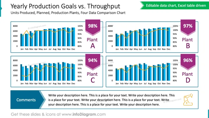
The slide provides a comparative analysis of production goals versus actual throughput for four different production plants, indicated as Plant A, Plant B, Plant C, and Plant D. Each plant's data is presented in a combination of bar and line charts over a 12-month period, with the percentage of the goal achieved prominently displayed in a colored hexagon beside each chart. Plant A achieved 98%, while Plant B, Plant C, and Plant D reached 97%, 94%, and 96% of their production goals, respectively. Below these charts is a section titled "Comments" for additional observations or explanations.
The slide is colorful, featuring a contrasting palette that helps in differentiating data points. The format is clean and efficient, lending itself to easy interpretation of complex data.


