Your graphics add a nice touch to my presentations and I recently used them for one of my all-hands meetings. Your toolbox adds professionalism to my slides. Instead of using standard clipart.
Claude Jones, Director of Engineer, @Walmartlabs, USA
Your graphics add a nice touch to my presentations and I recently used them for one of my all-hands meetings. Your toolbox adds professionalism to my slides. Instead of using standard clipart.
Claude Jones, Director of Engineer, @Walmartlabs, USA
I needed a fresh look at some of my slides. I've tried to find a way to create a paintbrush effect, to underline, accentuate, add some color and the handwritten markers were just the things. Very easy to use, easy to size, change the color. It was an affordable, perfect solution and I'm happy to recommend it.
Anonymous, US
The crisp, clean look of the graphics, and the fact that it allowed me to easily edit and change the colors to match the template was my main reason for purchasing them.
Brandie Jenkins, E-learning Developer, USA
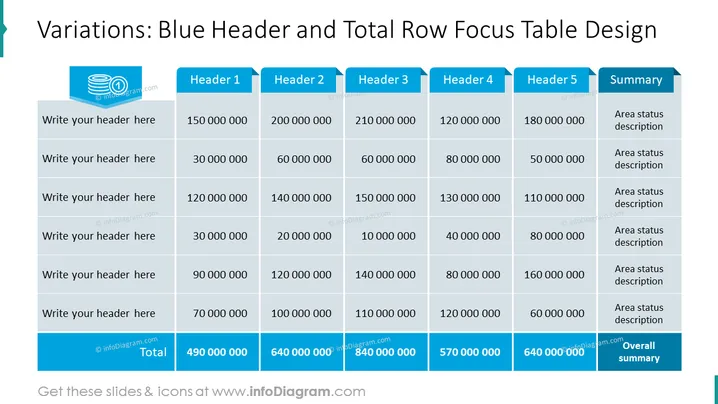
Slide Content: The slide features a table designed to showcase data with emphasis on the header and total row. The headers "Header 1" through "Header 5" suggest categorization of information along the top, with "Summary" pointing to additional details. Each row invites the viewer to insert descriptions or data points under the headers, with the bottom row indicating aggregated "Total" values, providing an overview of the numerical data and an "Overall summary" to encapsulate the findings. This format is structured to effectively communicate complex data in a visually-organized way.
Graphical Look:
The overall look of the slide is clean and professional, with a color scheme focused on shades of blue and grey that highlight key areas of the table. The design employs contrast to draw attention to the header and total rows, ensuring they are easily distinguishable.
Use Cases:


