Your graphics add a nice touch to my presentations and I recently used them for one of my all-hands meetings. Your toolbox adds professionalism to my slides. Instead of using standard clipart.
Claude Jones, Director of Engineer, @Walmartlabs, USA
Your graphics add a nice touch to my presentations and I recently used them for one of my all-hands meetings. Your toolbox adds professionalism to my slides. Instead of using standard clipart.
Claude Jones, Director of Engineer, @Walmartlabs, USA
I needed a fresh look at some of my slides. I've tried to find a way to create a paintbrush effect, to underline, accentuate, add some color and the handwritten markers were just the things. Very easy to use, easy to size, change the color. It was an affordable, perfect solution and I'm happy to recommend it.
Anonymous, US
The crisp, clean look of the graphics, and the fact that it allowed me to easily edit and change the colors to match the template was my main reason for purchasing them.
Brandie Jenkins, E-learning Developer, USA
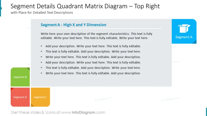
The slide provides an overview of "Segment A - High X and Y Dimension" within a quadrant matrix diagram. The slide contains placeholders for detailed text descriptions enabling users to add their own tailored content. Each bullet point prompts the user to insert text, which suggests customizing the slide to describe specific characteristics or data related to Segment A, which apparently scores high on both the X and Y axes being assessed.
The slide has a professional and clean appearance, using color coding to differentiate between the segments. The layout is structured in a way that allows for easy interpretation of information.


