Your graphics add a nice touch to my presentations and I recently used them for one of my all-hands meetings. Your toolbox adds professionalism to my slides. Instead of using standard clipart.
Claude Jones, Director of Engineer, @Walmartlabs, USA
Your graphics add a nice touch to my presentations and I recently used them for one of my all-hands meetings. Your toolbox adds professionalism to my slides. Instead of using standard clipart.
Claude Jones, Director of Engineer, @Walmartlabs, USA
I needed a fresh look at some of my slides. I've tried to find a way to create a paintbrush effect, to underline, accentuate, add some color and the handwritten markers were just the things. Very easy to use, easy to size, change the color. It was an affordable, perfect solution and I'm happy to recommend it.
Anonymous, US
The crisp, clean look of the graphics, and the fact that it allowed me to easily edit and change the colors to match the template was my main reason for purchasing them.
Brandie Jenkins, E-learning Developer, USA
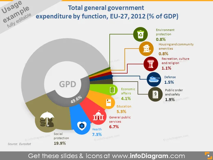
The slide presents a breakdown of the European Union's general government spending as a percentage of GDP by function for the year 2012. The largest share is Social protection at 19.9%, followed by General public services (6.7%), Health (7.3%), and Education (5.3%). Lesser amounts are spent on Economic affairs (4.1%), Public order and safety (1.9%), Defense (1.5%), Recreation, culture, and religion (1.1%), and the smallest on Housing and community amenities as well as Environment protection, both at 0.8%.
The overall look is professional with a clear focus on data representation. The use of color and icons makes the information easy to digest at a glance.


