Your graphics add a nice touch to my presentations and I recently used them for one of my all-hands meetings. Your toolbox adds professionalism to my slides. Instead of using standard clipart.
Claude Jones, Director of Engineer, @Walmartlabs, USA
Your graphics add a nice touch to my presentations and I recently used them for one of my all-hands meetings. Your toolbox adds professionalism to my slides. Instead of using standard clipart.
Claude Jones, Director of Engineer, @Walmartlabs, USA
I needed a fresh look at some of my slides. I've tried to find a way to create a paintbrush effect, to underline, accentuate, add some color and the handwritten markers were just the things. Very easy to use, easy to size, change the color. It was an affordable, perfect solution and I'm happy to recommend it.
Anonymous, US
The crisp, clean look of the graphics, and the fact that it allowed me to easily edit and change the colors to match the template was my main reason for purchasing them.
Brandie Jenkins, E-learning Developer, USA
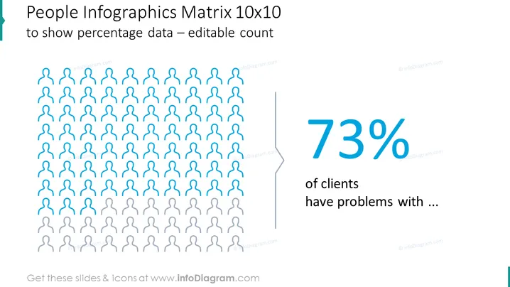
The slide presents a "People Infographics Matrix 10x10" as a visual tool to showcase percentage data, specifically editable count. It includes a grid of icons representing individuals, with a portion highlighted to indicate a percentage. Accompanying this is a large, bold "73%" symbol and text indicating that this figure relates to "clients have problems with ...," suggesting a survey or statistical outcome where the majority of a group has encountered issues.
The slide has a professional and clear visual presentation, designed to communicate statistical data effectively. The use of colour contrast and size differentiation helps in highlighting the key information.


