Your graphics add a nice touch to my presentations and I recently used them for one of my all-hands meetings. Your toolbox adds professionalism to my slides. Instead of using standard clipart.
Claude Jones, Director of Engineer, @Walmartlabs, USA
Your graphics add a nice touch to my presentations and I recently used them for one of my all-hands meetings. Your toolbox adds professionalism to my slides. Instead of using standard clipart.
Claude Jones, Director of Engineer, @Walmartlabs, USA
I needed a fresh look at some of my slides. I've tried to find a way to create a paintbrush effect, to underline, accentuate, add some color and the handwritten markers were just the things. Very easy to use, easy to size, change the color. It was an affordable, perfect solution and I'm happy to recommend it.
Anonymous, US
The crisp, clean look of the graphics, and the fact that it allowed me to easily edit and change the colors to match the template was my main reason for purchasing them.
Brandie Jenkins, E-learning Developer, USA
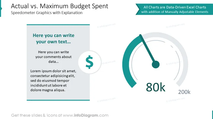
The slide presents a comparison of actual versus maximum budget spent using speedometer graphics for visualization. The left side of the slide has a text box where one can add personalized commentary about the data presented, starting with a prompt "Here you can write your own text...". It's followed by sample text, illustrating where further detail or analysis could be included to elaborate on the budget spending.
The slide is clean and professional-looking with a color scheme that uses teal, blue, and grey, which are pleasing to the eye and gives an impression of organized data presentation.


