

Your graphics add a nice touch to my presentations and I recently used them for one of my all-hands meetings. Your toolbox adds professionalism to my slides. Instead of using standard clipart.
Claude Jones, Director of Engineer, @Walmartlabs, USA

Your graphics add a nice touch to my presentations and I recently used them for one of my all-hands meetings. Your toolbox adds professionalism to my slides. Instead of using standard clipart.
Claude Jones, Director of Engineer, @Walmartlabs, USA
I needed a fresh look at some of my slides. I've tried to find a way to create a paintbrush effect, to underline, accentuate, add some color and the handwritten markers were just the things. Very easy to use, easy to size, change the color. It was an affordable, perfect solution and I'm happy to recommend it.
Anonymous, US
The crisp, clean look of the graphics, and the fact that it allowed me to easily edit and change the colors to match the template was my main reason for purchasing them.
Brandie Jenkins, E-learning Developer, USA
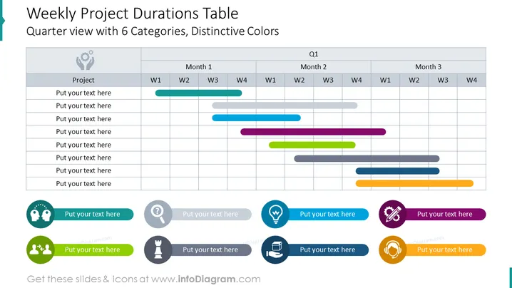
This PowerPoint slide, titled "Weekly Project Durations Table", presents a quarterly view with 6 categories using distinctive colors. The table is organized into columns for Weeks 1 to 4 across three months, signifying a quarter. Each row presumably represents a different project or task, color-coded to illustrate the duration and timeframe. The colors help differentiate between tasks while aligning them to the respective weeks across months, facilitating a visual representation of overlapping activities and workload distribution.
The slide utilizes a clean and professional design with a light gray grid table against a white background. The use of color on the horizontal bars adds visual interest and aids in distinguishing between different elements.



