

Your graphics add a nice touch to my presentations and I recently used them for one of my all-hands meetings. Your toolbox adds professionalism to my slides. Instead of using standard clipart.
Claude Jones, Director of Engineer, @Walmartlabs, USA

Your graphics add a nice touch to my presentations and I recently used them for one of my all-hands meetings. Your toolbox adds professionalism to my slides. Instead of using standard clipart.
Claude Jones, Director of Engineer, @Walmartlabs, USA
I needed a fresh look at some of my slides. I've tried to find a way to create a paintbrush effect, to underline, accentuate, add some color and the handwritten markers were just the things. Very easy to use, easy to size, change the color. It was an affordable, perfect solution and I'm happy to recommend it.
Anonymous, US
The crisp, clean look of the graphics, and the fact that it allowed me to easily edit and change the colors to match the template was my main reason for purchasing them.
Brandie Jenkins, E-learning Developer, USA
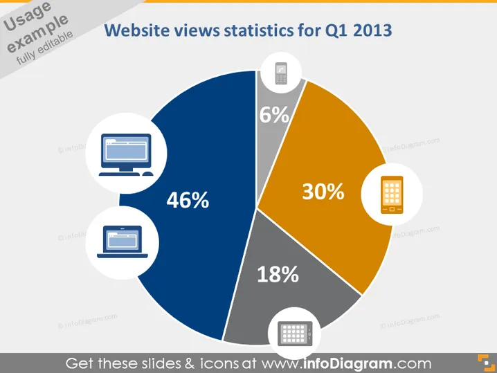
The slide presents the distribution of website views by device for Q1 2013, segmented in a pie chart format. Desktop views constitute the majority at 46%, followed by tablet views at 30%, and mobile phone and other device views at 18% and 6% respectively. Each segment is represented by an icon suggesting the type of device it refers to—desktop, tablet, mobile phone, and other. These statistics could be essential for understanding user behavior and informing website design and optimization strategies.
The overall look of the slide is clean and professional with a data-centric design. The use of distinct colors and clear icons aids in quick comprehension of the information presented.



