
Your graphics add a nice touch to my presentations and I recently used them for one of my all-hands meetings. Your toolbox adds professionalism to my slides. Instead of using standard clipart.
Claude Jones, Director of Engineer, @Walmartlabs, USA
Your graphics add a nice touch to my presentations and I recently used them for one of my all-hands meetings. Your toolbox adds professionalism to my slides. Instead of using standard clipart.
Claude Jones, Director of Engineer, @Walmartlabs, USA
I needed a fresh look at some of my slides. I've tried to find a way to create a paintbrush effect, to underline, accentuate, add some color and the handwritten markers were just the things. Very easy to use, easy to size, change the color. It was an affordable, perfect solution and I'm happy to recommend it.
Anonymous, US
The crisp, clean look of the graphics, and the fact that it allowed me to easily edit and change the colors to match the template was my main reason for purchasing them.
Brandie Jenkins, E-learning Developer, USA
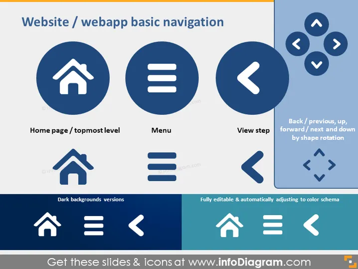
The slide presents icons representing basic navigation elements for a website or web application. It highlights three primary navigation components: the home page or topmost level icon (house symbol), indicating the main page of a site; the menu icon (three horizontal lines), denoting a drop-down or pop-out list of options; and the view step icon (arrow symbol), which suggests moving to the previous or next view. Additional directives include back/previous, up, forward/next, and down navigation, illustrated by arrows pointing in relative directions to indicate movement between pages or sections.
The slide has a clean, professional look with a strong visual hierarchy that clearly emphasizes the navigation icons. The color scheme is limited to white, varying shades of blue, and a touch of orange, providing a striking contrast that makes the information easily discernible.




