
Your graphics add a nice touch to my presentations and I recently used them for one of my all-hands meetings. Your toolbox adds professionalism to my slides. Instead of using standard clipart.
Claude Jones, Director of Engineer, @Walmartlabs, USA

Your graphics add a nice touch to my presentations and I recently used them for one of my all-hands meetings. Your toolbox adds professionalism to my slides. Instead of using standard clipart.
Claude Jones, Director of Engineer, @Walmartlabs, USA
I needed a fresh look at some of my slides. I've tried to find a way to create a paintbrush effect, to underline, accentuate, add some color and the handwritten markers were just the things. Very easy to use, easy to size, change the color. It was an affordable, perfect solution and I'm happy to recommend it.
Anonymous, US
The crisp, clean look of the graphics, and the fact that it allowed me to easily edit and change the colors to match the template was my main reason for purchasing them.
Brandie Jenkins, E-learning Developer, USA
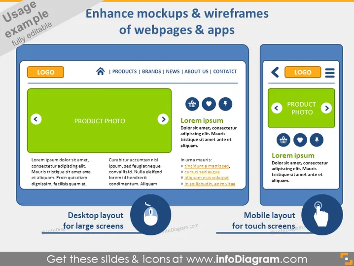
The slide is centered around the theme of enhancing mockups and wireframes for webpages and applications. It includes comparisons between "Desktop layout for large screens" and "Mobile layout for touch screens", suggesting a focus on responsive design and cross-device compatibility. The desktop layout section shows a traditional navigation bar and places emphasis on a product photo, while the mobile layout emphasizes simplified navigation and touch-friendly interfaces. Bullet points highlight key areas where text appears to describe features or elements of the mockup.
The slide is structured to offer a clear and visually engaging comparison between desktop and mobile layouts. The use of color coding—for green representing desktop and blue for mobile—assists in guiding the viewer’s attention effectively between the different mockup types.