

Your graphics add a nice touch to my presentations and I recently used them for one of my all-hands meetings. Your toolbox adds professionalism to my slides. Instead of using standard clipart.
Claude Jones, Director of Engineer, @Walmartlabs, USA

Your graphics add a nice touch to my presentations and I recently used them for one of my all-hands meetings. Your toolbox adds professionalism to my slides. Instead of using standard clipart.
Claude Jones, Director of Engineer, @Walmartlabs, USA
I needed a fresh look at some of my slides. I've tried to find a way to create a paintbrush effect, to underline, accentuate, add some color and the handwritten markers were just the things. Very easy to use, easy to size, change the color. It was an affordable, perfect solution and I'm happy to recommend it.
Anonymous, US
The crisp, clean look of the graphics, and the fact that it allowed me to easily edit and change the colors to match the template was my main reason for purchasing them.
Brandie Jenkins, E-learning Developer, USA
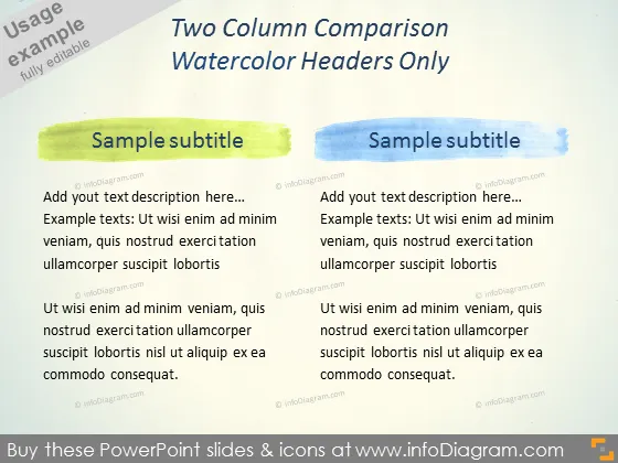
This PowerPoint slide features a two-column comparison layout, each with a watercolor header. The left column's header is painted in a lime green hue, while the right column's header is in a sky blue. These columns are designed to compare two sets of texts or subjects. For example, one might use the columns to compare benefits and drawbacks, two different products, or two opposing arguments. The sample text is a placeholder commonly found in templates, suggesting where the presenter should insert their own content, which might detail the features, advantages, or other comparative points about their subjects.
The overall look of the slide is creative yet simple, using color blocks to define sections clearly. The watercolor headers add an artistic touch, contrasting with the otherwise minimalist and professional presentation format.



