
Your graphics add a nice touch to my presentations and I recently used them for one of my all-hands meetings. Your toolbox adds professionalism to my slides. Instead of using standard clipart.
Claude Jones, Director of Engineer, @Walmartlabs, USA
Your graphics add a nice touch to my presentations and I recently used them for one of my all-hands meetings. Your toolbox adds professionalism to my slides. Instead of using standard clipart.
Claude Jones, Director of Engineer, @Walmartlabs, USA
I needed a fresh look at some of my slides. I've tried to find a way to create a paintbrush effect, to underline, accentuate, add some color and the handwritten markers were just the things. Very easy to use, easy to size, change the color. It was an affordable, perfect solution and I'm happy to recommend it.
Anonymous, US
The crisp, clean look of the graphics, and the fact that it allowed me to easily edit and change the colors to match the template was my main reason for purchasing them.
Brandie Jenkins, E-learning Developer, USA
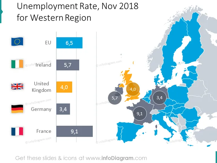
The PowerPoint slide presents unemployment rates for different regions in Western Europe for November 2018. The European Union average is shown as 6.5%, with Ireland at 5.7%, the United Kingdom at 4.0%, Germany at 3.4%, and France at a significantly higher 9.1%. Each country's unemployment rate is associated with its flag, providing a visual reference to the country's data point.
The slide has a clean and modern aesthetic, with clear visual emphasis on data representation. The use of flags and a map is an effective way to link data to geography.




