

Your graphics add a nice touch to my presentations and I recently used them for one of my all-hands meetings. Your toolbox adds professionalism to my slides. Instead of using standard clipart.
Claude Jones, Director of Engineer, @Walmartlabs, USA

Your graphics add a nice touch to my presentations and I recently used them for one of my all-hands meetings. Your toolbox adds professionalism to my slides. Instead of using standard clipart.
Claude Jones, Director of Engineer, @Walmartlabs, USA
I needed a fresh look at some of my slides. I've tried to find a way to create a paintbrush effect, to underline, accentuate, add some color and the handwritten markers were just the things. Very easy to use, easy to size, change the color. It was an affordable, perfect solution and I'm happy to recommend it.
Anonymous, US
The crisp, clean look of the graphics, and the fact that it allowed me to easily edit and change the colors to match the template was my main reason for purchasing them.
Brandie Jenkins, E-learning Developer, USA
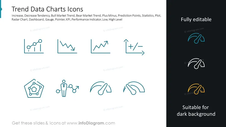
The slide titled "Trend Data Charts Icons" presents a series of pictorial icons related to data trends and analysis, which includes an increase and decrease tendency, bull and bear market trends, statistical plus and minus, prediction points, and various measurement tools such as radar charts, dashboards, gauges, and pointers. The concept of KPI (Key Performance Indicator) is also represented, along with indicators for low and high levels, providing visual cues for presentations that deal with performance monitoring and data visualization in a business context. Each icon is a simple visual metaphor for the respective data concept it represents.
The slide's overall look is clean, modern, and professional. The use of simple icons and minimal text allows for easy interpretation and promotes a focus on the concepts illustrated.



