

Your graphics add a nice touch to my presentations and I recently used them for one of my all-hands meetings. Your toolbox adds professionalism to my slides. Instead of using standard clipart.
Claude Jones, Director of Engineer, @Walmartlabs, USA

Your graphics add a nice touch to my presentations and I recently used them for one of my all-hands meetings. Your toolbox adds professionalism to my slides. Instead of using standard clipart.
Claude Jones, Director of Engineer, @Walmartlabs, USA
I needed a fresh look at some of my slides. I've tried to find a way to create a paintbrush effect, to underline, accentuate, add some color and the handwritten markers were just the things. Very easy to use, easy to size, change the color. It was an affordable, perfect solution and I'm happy to recommend it.
Anonymous, US
The crisp, clean look of the graphics, and the fact that it allowed me to easily edit and change the colors to match the template was my main reason for purchasing them.
Brandie Jenkins, E-learning Developer, USA
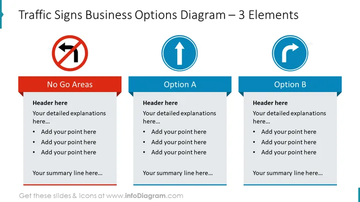
The slide is divided into three sections, each featuring a different traffic sign to represent a business concept. The first section "No Go Areas" indicates areas, strategies, or practices to avoid. The second section "Option A" suggests a potential path or strategy to follow, while the third section "Option B" presents an alternative route or method. Each segment provides space for a header, detailed explanations, bullet points to add specific items, and a summary line, allowing for a structured comparison or analysis of different business options or decisions.
The slide boasts a professional and modern visual design with vibrant colors that clearly separate the concepts. The use of traffic signs as metaphors for business concepts makes the information immediately recognizable and easy to process.



