

Your graphics add a nice touch to my presentations and I recently used them for one of my all-hands meetings. Your toolbox adds professionalism to my slides. Instead of using standard clipart.
Claude Jones, Director of Engineer, @Walmartlabs, USA

Your graphics add a nice touch to my presentations and I recently used them for one of my all-hands meetings. Your toolbox adds professionalism to my slides. Instead of using standard clipart.
Claude Jones, Director of Engineer, @Walmartlabs, USA
I needed a fresh look at some of my slides. I've tried to find a way to create a paintbrush effect, to underline, accentuate, add some color and the handwritten markers were just the things. Very easy to use, easy to size, change the color. It was an affordable, perfect solution and I'm happy to recommend it.
Anonymous, US
The crisp, clean look of the graphics, and the fact that it allowed me to easily edit and change the colors to match the template was my main reason for purchasing them.
Brandie Jenkins, E-learning Developer, USA
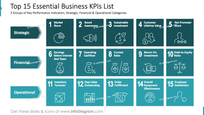
This slide outlines key performance indicators divided into three categories: Strategic, Financial, and Operational. Strategic KPIs include Market Share, Brand Awareness, Sustainable Investment, Customer Lifetime Value, and Net Promoter Score, emphasizing long-term business growth. Financial metrics such as Earnings Before Interest and Taxes, Operating Cashflow, Current Ratio, Return On Investment, and Debt-to-Equity Ratio highlight financial health. Operational KPIs include Inventory Turnover, Days Sales Outstanding, Order Fulfillment, Overall Equipment Effectiveness, and Employee Satisfaction, focusing on efficient processes.
Title and Subtitle: Positioned at the top, with bold black text for the title and a smaller font for the subtitle.
Category Labels: "Strategic," "Financial," and "Operational" are written on teal arrows placed vertically on the left.
KPI Boxes: Individual KPIs are displayed in teal boxes, numbered from 1 to 15, each with a simple white icon representing the KPI.
Icons: Icons such as pie charts, megaphones, scales, and people are used to visually represent each KPI.
Layout: The slide is organized in a grid, with KPIs grouped by category, featuring consistent sizing and alignment.
The slide utilizes a structured grid system and a consistent color palette of teal and white, resulting in a clean and organized appearance. The use of simple icons aids in quickly conveying the essence of each KPI.



