
Your graphics add a nice touch to my presentations and I recently used them for one of my all-hands meetings. Your toolbox adds professionalism to my slides. Instead of using standard clipart.
Claude Jones, Director of Engineer, @Walmartlabs, USA

Your graphics add a nice touch to my presentations and I recently used them for one of my all-hands meetings. Your toolbox adds professionalism to my slides. Instead of using standard clipart.
Claude Jones, Director of Engineer, @Walmartlabs, USA

I needed a fresh look at some of my slides. I've tried to find a way to create a paintbrush effect, to underline, accentuate, add some color and the handwritten markers were just the things. Very easy to use, easy to size, change the color. It was an affordable, perfect solution and I'm happy to recommend it.
Anonymous, US
The crisp, clean look of the graphics, and the fact that it allowed me to easily edit and change the colors to match the template was my main reason for purchasing them.
Brandie Jenkins, E-learning Developer, USA
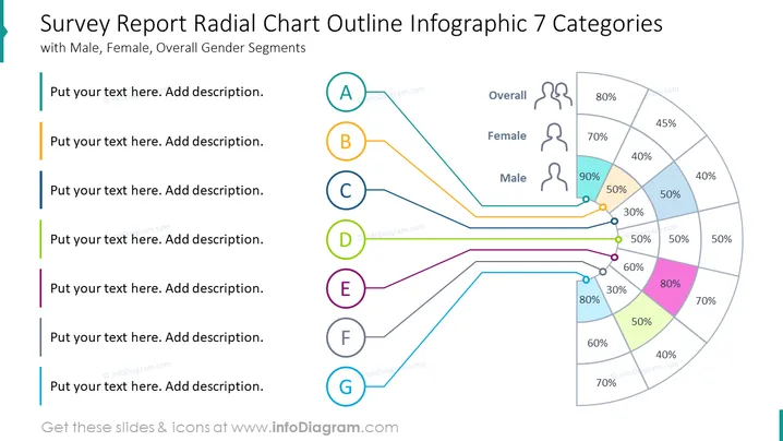
The PowerPoint slide titled "Survey Report Radial Chart Outline Infographic 7 Categories" illustrates a radial chart representing survey data segmented by gender. Each segment (A-G) corresponds to a data point on the radial chart, indicating the percentage of responses. These percentages are visualized by the length of the segments radiating outwards, with separate colors for male, female, and overall data. The radial chart allows comparisons across different categories and genders, facilitating analysis of survey results.
The slide employs a clean and professional design, using a balanced mix of text, icons, and a radial chart to convey data in a visually appealing manner. Sharp contrasts between the colors of the data points and the gray shades of the chart segments ensure clarity and focus on the information being presented.


