

Your graphics add a nice touch to my presentations and I recently used them for one of my all-hands meetings. Your toolbox adds professionalism to my slides. Instead of using standard clipart.
Claude Jones, Director of Engineer, @Walmartlabs, USA

Your graphics add a nice touch to my presentations and I recently used them for one of my all-hands meetings. Your toolbox adds professionalism to my slides. Instead of using standard clipart.
Claude Jones, Director of Engineer, @Walmartlabs, USA
I needed a fresh look at some of my slides. I've tried to find a way to create a paintbrush effect, to underline, accentuate, add some color and the handwritten markers were just the things. Very easy to use, easy to size, change the color. It was an affordable, perfect solution and I'm happy to recommend it.
Anonymous, US
The crisp, clean look of the graphics, and the fact that it allowed me to easily edit and change the colors to match the template was my main reason for purchasing them.
Brandie Jenkins, E-learning Developer, USA
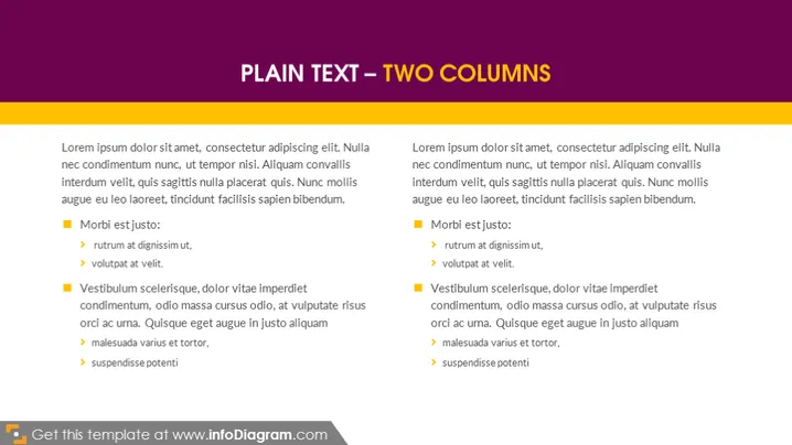
The slide presents a comparison of two topics in separate columns using standard 'Lorem ipsum' placeholder text, which is commonly used in the design industry as a temporary text placeholder. Each column begins with the same introductory sentence and then splits into two sections highlighted by square bullet points with sub-items marked by arrows. The sections are labeled "Morbi est justo" and "Vestibulum scelerisque," suggesting two distinct points of discussion or comparison, although the meanings of these labels are unclear due to the generic Latin text.
The overall design is minimalist and professional, focusing the audience's attention on the text. The symmetrical layout provides a visually balanced structure, perfect for comparison or displaying two sets of information concurrently.



