

Your graphics add a nice touch to my presentations and I recently used them for one of my all-hands meetings. Your toolbox adds professionalism to my slides. Instead of using standard clipart.
Claude Jones, Director of Engineer, @Walmartlabs, USA

Your graphics add a nice touch to my presentations and I recently used them for one of my all-hands meetings. Your toolbox adds professionalism to my slides. Instead of using standard clipart.
Claude Jones, Director of Engineer, @Walmartlabs, USA
I needed a fresh look at some of my slides. I've tried to find a way to create a paintbrush effect, to underline, accentuate, add some color and the handwritten markers were just the things. Very easy to use, easy to size, change the color. It was an affordable, perfect solution and I'm happy to recommend it.
Anonymous, US
The crisp, clean look of the graphics, and the fact that it allowed me to easily edit and change the colors to match the template was my main reason for purchasing them.
Brandie Jenkins, E-learning Developer, USA
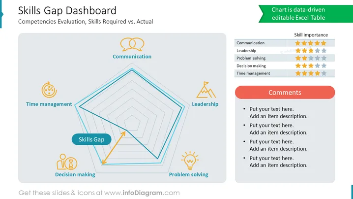
Examples of skills you can include on such a dashboard:
The slide is divided into two sections by a vertical line. The left section contains the text content, and the right section contains a table. The table has four columns: Competency, Skills Required, Actual Skills, and Skills Gap. The table is color-coded to show the severity of the skills gap. Green indicates that there is no skills gap, yellow indicates that there is a small skills gap, and red indicates that there is a large skills gap.
The slide is designed to be visually appealing and easy to read. The text is in a large font size, and the colors are high-contrast. The table is also easy to read, and the color-coding helps to quickly identify the areas where there are skills gaps.
The slide can be used to communicate the results of a skills gap analysis to stakeholders. It can also be used to track progress over time and to identify areas where training and development are needed.



