

Your graphics add a nice touch to my presentations and I recently used them for one of my all-hands meetings. Your toolbox adds professionalism to my slides. Instead of using standard clipart.
Claude Jones, Director of Engineer, @Walmartlabs, USA

Your graphics add a nice touch to my presentations and I recently used them for one of my all-hands meetings. Your toolbox adds professionalism to my slides. Instead of using standard clipart.
Claude Jones, Director of Engineer, @Walmartlabs, USA
I needed a fresh look at some of my slides. I've tried to find a way to create a paintbrush effect, to underline, accentuate, add some color and the handwritten markers were just the things. Very easy to use, easy to size, change the color. It was an affordable, perfect solution and I'm happy to recommend it.
Anonymous, US
The crisp, clean look of the graphics, and the fact that it allowed me to easily edit and change the colors to match the template was my main reason for purchasing them.
Brandie Jenkins, E-learning Developer, USA
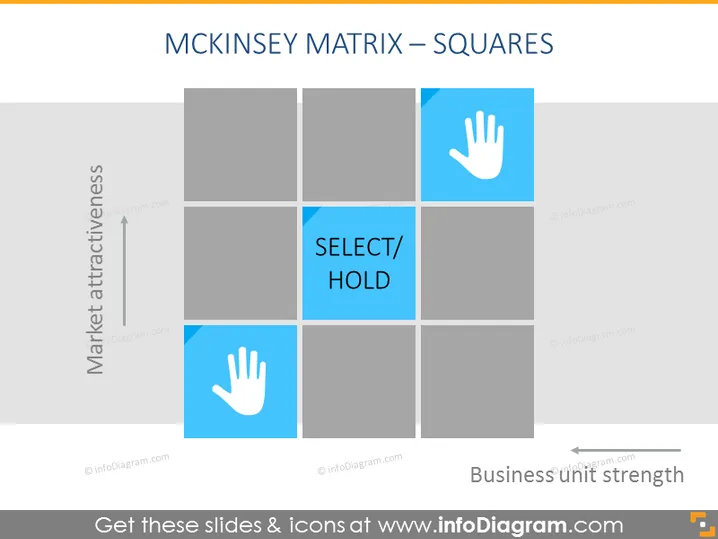
The slide presents the McKinsey Matrix using squares to categorize market attractiveness against business unit strength. The matrix is divided into nine squares, with varying shades indicating different levels. In the central column, one square is highlighted with the text "SELECT/ HOLD," suggesting a strategic decision to be made. This could be interpreted as identifying business units that are neither market leaders nor laggards and thus may require further analysis or targeted strategies for improvement or divestment.
The slide utilizes a minimal and clean design, with a muted color palette of grays and blues. The use of icons and color highlights specific areas within the matrix, creating an easy-to-understand visual message.



