

Your graphics add a nice touch to my presentations and I recently used them for one of my all-hands meetings. Your toolbox adds professionalism to my slides. Instead of using standard clipart.
Claude Jones, Director of Engineer, @Walmartlabs, USA

Your graphics add a nice touch to my presentations and I recently used them for one of my all-hands meetings. Your toolbox adds professionalism to my slides. Instead of using standard clipart.
Claude Jones, Director of Engineer, @Walmartlabs, USA
I needed a fresh look at some of my slides. I've tried to find a way to create a paintbrush effect, to underline, accentuate, add some color and the handwritten markers were just the things. Very easy to use, easy to size, change the color. It was an affordable, perfect solution and I'm happy to recommend it.
Anonymous, US
The crisp, clean look of the graphics, and the fact that it allowed me to easily edit and change the colors to match the template was my main reason for purchasing them.
Brandie Jenkins, E-learning Developer, USA
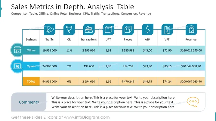
The slide presents a comparison table of offline and online retail business metrics, focusing on KPIs like traffic, conversion rates, transactions, and revenue. Traffic measures the number of visitors for both channels. CR (Conversion Rate) indicates the percentage of visitors who make a purchase. Transactions represent the number of completed sales. UPT (Units Per Transaction) shows the average items bought per purchase. ASP (Average Selling Price) indicates the average revenue per item sold. VPT (Value Per Transaction) represents the sales value per transaction, and Revenue displays the total earnings for each business channel.
The overall look is clean and organized, with icons and colors aiding segmentation of information. Simplicity and alignment ensure readability and quick comparison.



