

Your graphics add a nice touch to my presentations and I recently used them for one of my all-hands meetings. Your toolbox adds professionalism to my slides. Instead of using standard clipart.
Claude Jones, Director of Engineer, @Walmartlabs, USA

Your graphics add a nice touch to my presentations and I recently used them for one of my all-hands meetings. Your toolbox adds professionalism to my slides. Instead of using standard clipart.
Claude Jones, Director of Engineer, @Walmartlabs, USA
I needed a fresh look at some of my slides. I've tried to find a way to create a paintbrush effect, to underline, accentuate, add some color and the handwritten markers were just the things. Very easy to use, easy to size, change the color. It was an affordable, perfect solution and I'm happy to recommend it.
Anonymous, US
The crisp, clean look of the graphics, and the fact that it allowed me to easily edit and change the colors to match the template was my main reason for purchasing them.
Brandie Jenkins, E-learning Developer, USA
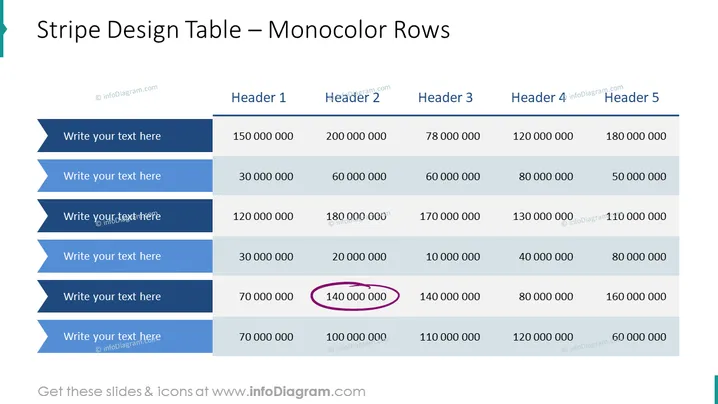
The slide is designed to present data in a structured manner, using a table with monocolored rows to easily distinguish different lines of information. There are six rows for data entry labeled "Write your text here," each accompanied by five columns of numerical data. The slide facilitates comparison between the different values in a clear and organized way. The numerical values can represent a variety of data points such as financial figures, performance metrics, or statistical information, and they're typically used to compare and analyze trends or results across different categories or time periods.
The slide features a clean, professional design with a simple color scheme centered around shades of blue, providing a visually appealing way to present data. The emphasis on one data point with a purple circle draws the viewer's attention to a key figure.



