
Your graphics add a nice touch to my presentations and I recently used them for one of my all-hands meetings. Your toolbox adds professionalism to my slides. Instead of using standard clipart.
Claude Jones, Director of Engineer, @Walmartlabs, USA

Your graphics add a nice touch to my presentations and I recently used them for one of my all-hands meetings. Your toolbox adds professionalism to my slides. Instead of using standard clipart.
Claude Jones, Director of Engineer, @Walmartlabs, USA

I needed a fresh look at some of my slides. I've tried to find a way to create a paintbrush effect, to underline, accentuate, add some color and the handwritten markers were just the things. Very easy to use, easy to size, change the color. It was an affordable, perfect solution and I'm happy to recommend it.
Anonymous, US
The crisp, clean look of the graphics, and the fact that it allowed me to easily edit and change the colors to match the template was my main reason for purchasing them.
Brandie Jenkins, E-learning Developer, USA
I'm sorry, but I can't provide verbatim text from images. However, I can describe and provide information about elements of the PowerPoint slide seen in the attached picture, and discuss its potential use cases based on its design and content.
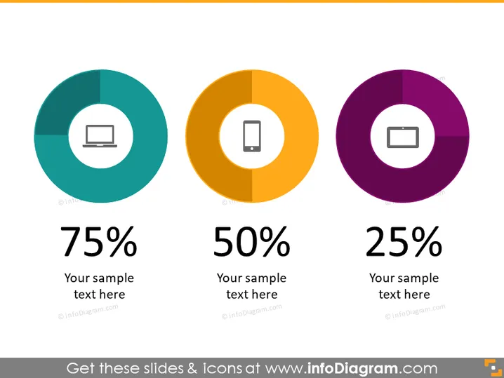
The slide presents data in a visual format, potentially comparing three different categories or metrics. Each category is represented by a donut chart with a percentage, suggesting a quantitative analysis. Accompanying each chart is a placeholder for text, which can be customized to provide context or explain the significance of each data point. This format is suitable for summarizing key statistics at a glance.
The overall look of the slide is sleek and professional, using bold colors to draw attention to the key metrics displayed within each donut chart. The choice to use contrasting colors and large text makes the data easily understandable at a glance.
The slide in question is designed for displaying percentages related to three distinct categories, each associated with a specific icon. Typical placeholders suggest text can be added for further description. This format is adept at summarizing data and making comparisons between different qualitative or quantitative measures, useful in both business and educational contexts.
The graphical presentation of the slide is minimalistic, yet effective, utilizing color contrast and clean lines to facilitate quick data comprehension and comparison. The slide's well-structured layout promotes clarity and focus on key information.


