
Your graphics add a nice touch to my presentations and I recently used them for one of my all-hands meetings. Your toolbox adds professionalism to my slides. Instead of using standard clipart.
Claude Jones, Director of Engineer, @Walmartlabs, USA

Your graphics add a nice touch to my presentations and I recently used them for one of my all-hands meetings. Your toolbox adds professionalism to my slides. Instead of using standard clipart.
Claude Jones, Director of Engineer, @Walmartlabs, USA

I needed a fresh look at some of my slides. I've tried to find a way to create a paintbrush effect, to underline, accentuate, add some color and the handwritten markers were just the things. Very easy to use, easy to size, change the color. It was an affordable, perfect solution and I'm happy to recommend it.
Anonymous, US
The crisp, clean look of the graphics, and the fact that it allowed me to easily edit and change the colors to match the template was my main reason for purchasing them.
Brandie Jenkins, E-learning Developer, USA
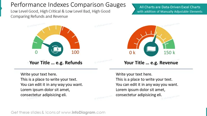
The slide illustrates two performance gauges that compare different metrics, indicating 'Refunds' and 'Revenue' as examples. The left gauge presents a green to red gradient suggesting that low levels are good and high levels are critical, which is typically applied to measures where a lower figure is preferred, like a refund or error rate. The right gauge inversely represents a metric where high figures are favorable, as it's color-coded green in the higher end, suitable for KPIs like revenue or sales volume. Placeholder text below each gauge suggests areas for customization.
The slide features a bold, clean design with a good balance of graphics and text. The contrasting colors draw attention to the gauges, which are the focal point.


