

Your graphics add a nice touch to my presentations and I recently used them for one of my all-hands meetings. Your toolbox adds professionalism to my slides. Instead of using standard clipart.
Claude Jones, Director of Engineer, @Walmartlabs, USA

Your graphics add a nice touch to my presentations and I recently used them for one of my all-hands meetings. Your toolbox adds professionalism to my slides. Instead of using standard clipart.
Claude Jones, Director of Engineer, @Walmartlabs, USA
I needed a fresh look at some of my slides. I've tried to find a way to create a paintbrush effect, to underline, accentuate, add some color and the handwritten markers were just the things. Very easy to use, easy to size, change the color. It was an affordable, perfect solution and I'm happy to recommend it.
Anonymous, US
The crisp, clean look of the graphics, and the fact that it allowed me to easily edit and change the colors to match the template was my main reason for purchasing them.
Brandie Jenkins, E-learning Developer, USA
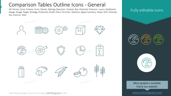
The PowerPoint slide titled "Comparison Tables Outline Icons - General" lists various icon categories like HR, Person, Coins, Finance, Settings, Execution, Product, and Strategy, among others. These icon categories represent different business elements such as human resources, financial assets, operational tools, products, strategic planning, and data analysis. Icons like a pie chart and sigma suggest statistical and analytical representation, while others like milk, almonds, soy, and coconut may relate to agriculture or food industry items.
The overall look is clean and modern, with the icons arranged in a grid pattern that makes it easy to scan visually. The minimalist design ensures the icons stand out against the dark background, making them the central focus of the slide.



