

Your graphics add a nice touch to my presentations and I recently used them for one of my all-hands meetings. Your toolbox adds professionalism to my slides. Instead of using standard clipart.
Claude Jones, Director of Engineer, @Walmartlabs, USA

Your graphics add a nice touch to my presentations and I recently used them for one of my all-hands meetings. Your toolbox adds professionalism to my slides. Instead of using standard clipart.
Claude Jones, Director of Engineer, @Walmartlabs, USA
I needed a fresh look at some of my slides. I've tried to find a way to create a paintbrush effect, to underline, accentuate, add some color and the handwritten markers were just the things. Very easy to use, easy to size, change the color. It was an affordable, perfect solution and I'm happy to recommend it.
Anonymous, US
The crisp, clean look of the graphics, and the fact that it allowed me to easily edit and change the colors to match the template was my main reason for purchasing them.
Brandie Jenkins, E-learning Developer, USA
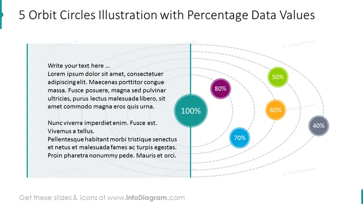
The 5 Orbit Circles with Percentage Data Values Slide can represent data such as customer demographics, sales figures, or any other numerical data that can be segmented into categories. The orbit circles provide a clear and concise way to communicate complex data and make it easy for your audience to understand the importance of each category. It can showcase your data in a visually appealing and engaging way and make a strong impression on your audience. This PPT slide is part of the Orbit Diagram Infographics Slide Deck. Click on the picture to see the whole presentation. You can download this PPT template on Google Slides and Keynote.
##5 Orbit Circles with Percentage Data Values Slide slide infographics White Background, Text Box, 5 Orbit Circles Diagram, Colorful Circles



