

Your graphics add a nice touch to my presentations and I recently used them for one of my all-hands meetings. Your toolbox adds professionalism to my slides. Instead of using standard clipart.
Claude Jones, Director of Engineer, @Walmartlabs, USA

Your graphics add a nice touch to my presentations and I recently used them for one of my all-hands meetings. Your toolbox adds professionalism to my slides. Instead of using standard clipart.
Claude Jones, Director of Engineer, @Walmartlabs, USA
I needed a fresh look at some of my slides. I've tried to find a way to create a paintbrush effect, to underline, accentuate, add some color and the handwritten markers were just the things. Very easy to use, easy to size, change the color. It was an affordable, perfect solution and I'm happy to recommend it.
Anonymous, US
The crisp, clean look of the graphics, and the fact that it allowed me to easily edit and change the colors to match the template was my main reason for purchasing them.
Brandie Jenkins, E-learning Developer, USA
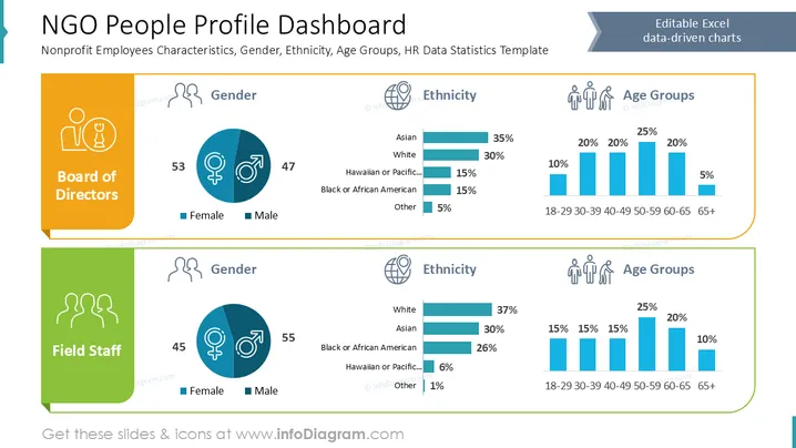
This slide presents a dashboard of NGO personnel profiles, divided into two categories: Board of Directors and Field Staff. For each category, it outlines gender distribution (female and male percentages), ethnic diversity (with breakdowns like Asian, White, Black or African American, and others), and age groups (from 18-29 to 65+). The Board of Directors shows a slightly more balanced gender ratio compared to Field Staff, which has a higher percentage of males.
Title and Subtitle: The title is bold and centered with a descriptive subtitle below it.
Two Main Sections: The slide is split into two main colored sections, orange for "Board of Directors" and green for "Field Staff."
Icons: Each section begins with a relevant icon. The Board has a formal icon, while Field Staff has a group icon, both in white.
Gender Pie Charts: Each section contains a circular pie chart indicating gender distribution, using blue and teal colors.
Bar Charts: Ethnicity and age group data are represented through horizontal and vertical bar charts, employing consistent teal and blue hues.
Charts and Shapes: Charts are cleanly integrated with minimalistic lines and shading, enhancing readability without clutter.
The slide uses a clean design with a distinct color scheme, visually separating data categories, making comparison intuitive. Icons and charts are used appropriately to present statistical data clearly.
Board Meetings: Present demographic profiles during strategic discussions.
HR Reports: For summarizing employee diversity data in HR presentations.
Grant Applications: Showcase staff diversity statistics for funding purposes.
Stakeholder Engagement: Inform stakeholders about employee demographic distributions.



