

Your graphics add a nice touch to my presentations and I recently used them for one of my all-hands meetings. Your toolbox adds professionalism to my slides. Instead of using standard clipart.
Claude Jones, Director of Engineer, @Walmartlabs, USA

Your graphics add a nice touch to my presentations and I recently used them for one of my all-hands meetings. Your toolbox adds professionalism to my slides. Instead of using standard clipart.
Claude Jones, Director of Engineer, @Walmartlabs, USA
I needed a fresh look at some of my slides. I've tried to find a way to create a paintbrush effect, to underline, accentuate, add some color and the handwritten markers were just the things. Very easy to use, easy to size, change the color. It was an affordable, perfect solution and I'm happy to recommend it.
Anonymous, US
The crisp, clean look of the graphics, and the fact that it allowed me to easily edit and change the colors to match the template was my main reason for purchasing them.
Brandie Jenkins, E-learning Developer, USA
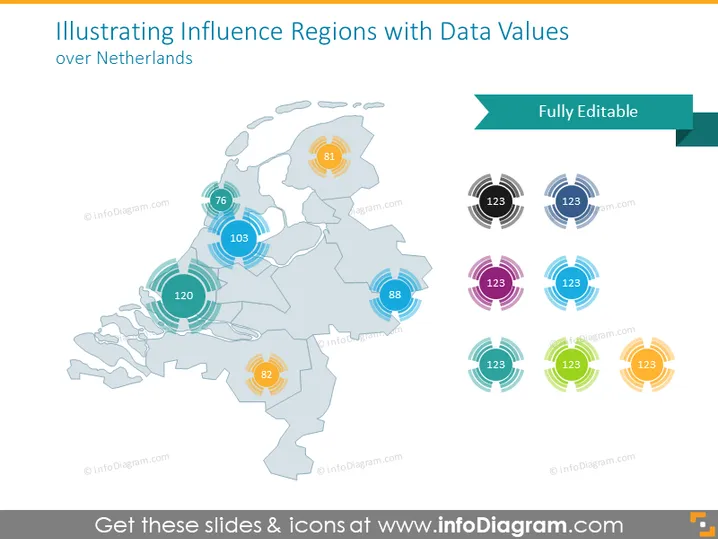
The slide displays a map of the Netherlands accompanied by data values that represent influence regions. Each region is highlighted with a circular graphic and a number inside, suggesting some kind of quantifiable metric. This could denote various regional data such as population, sales volume, or any other measurable statistic. The presence of multiple colors for the circular graphics indicates that different categories or types of data might be represented on this slide.
The slide has a clean, professional aesthetic with a color palette that is pleasing to the eye and not overwhelming. The design is clear, using both color and numerical data to present information effectively.



