
Your graphics add a nice touch to my presentations and I recently used them for one of my all-hands meetings. Your toolbox adds professionalism to my slides. Instead of using standard clipart.
Claude Jones, Director of Engineer, @Walmartlabs, USA
Your graphics add a nice touch to my presentations and I recently used them for one of my all-hands meetings. Your toolbox adds professionalism to my slides. Instead of using standard clipart.
Claude Jones, Director of Engineer, @Walmartlabs, USA
I needed a fresh look at some of my slides. I've tried to find a way to create a paintbrush effect, to underline, accentuate, add some color and the handwritten markers were just the things. Very easy to use, easy to size, change the color. It was an affordable, perfect solution and I'm happy to recommend it.
Anonymous, US
The crisp, clean look of the graphics, and the fact that it allowed me to easily edit and change the colors to match the template was my main reason for purchasing them.
Brandie Jenkins, E-learning Developer, USA
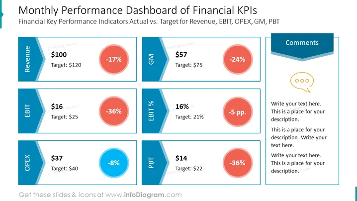
The slide presents a dashboard containing Financial Key Performance Indicators (KPIs) comparing actual results to targets for Revenue, Earnings Before Interest and Taxes (EBIT), Operating Expenses (OPEX), Gross Margin (GM), and Profit Before Tax (PBT). Each KPI has a dedicated panel displaying the actual value, the target, and the variance percentage. For example, "Revenue" shows an actual value of $100, below the target of $120, signifying a -17% variance. EBIT shows a significant shortfall with a -36% variance from its target.
The slide's overall look is modern and informative, utilizing color coding to quickly convey performance against targets. It emphasizes visual communication through the use of progress bars to illustrate variances.




