
Your graphics add a nice touch to my presentations and I recently used them for one of my all-hands meetings. Your toolbox adds professionalism to my slides. Instead of using standard clipart.
Claude Jones, Director of Engineer, @Walmartlabs, USA

Your graphics add a nice touch to my presentations and I recently used them for one of my all-hands meetings. Your toolbox adds professionalism to my slides. Instead of using standard clipart.
Claude Jones, Director of Engineer, @Walmartlabs, USA

I needed a fresh look at some of my slides. I've tried to find a way to create a paintbrush effect, to underline, accentuate, add some color and the handwritten markers were just the things. Very easy to use, easy to size, change the color. It was an affordable, perfect solution and I'm happy to recommend it.
Anonymous, US
The crisp, clean look of the graphics, and the fact that it allowed me to easily edit and change the colors to match the template was my main reason for purchasing them.
Brandie Jenkins, E-learning Developer, USA
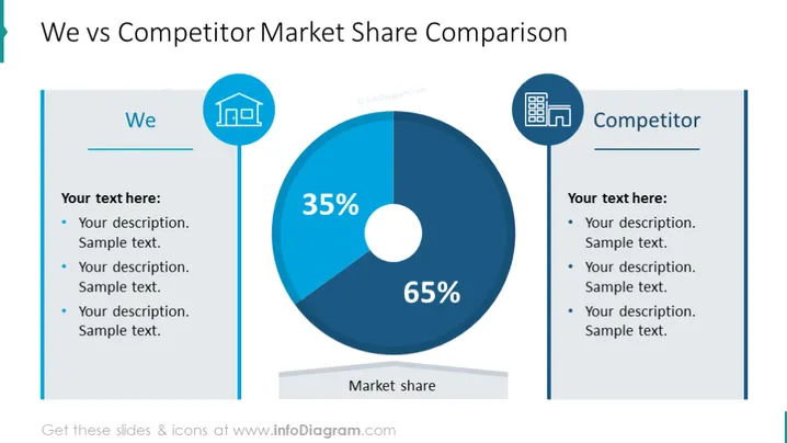
The slide is designed to compare the market share between "We" and a "Competitor" using a pie chart and text descriptions. The pie chart prominently displays two segments, one representing 35% of the market share and the other taking up 65%. Next to each heading—”We” and “Competitor”—there are spaces for descriptions, indicating the possibility to elaborate on each entity’s strengths or market position. Each section has three bullet points for adding custom text that will describe reasons or factors behind the market share distribution.
The overall look of the slide is professional and clean, with a symmetrical design that directly contrasts two entities. The use of blue tones and simple icons gives it a corporate feel, enhancing readability and focus on the central data.


