
Your graphics add a nice touch to my presentations and I recently used them for one of my all-hands meetings. Your toolbox adds professionalism to my slides. Instead of using standard clipart.
Claude Jones, Director of Engineer, @Walmartlabs, USA

Your graphics add a nice touch to my presentations and I recently used them for one of my all-hands meetings. Your toolbox adds professionalism to my slides. Instead of using standard clipart.
Claude Jones, Director of Engineer, @Walmartlabs, USA

I needed a fresh look at some of my slides. I've tried to find a way to create a paintbrush effect, to underline, accentuate, add some color and the handwritten markers were just the things. Very easy to use, easy to size, change the color. It was an affordable, perfect solution and I'm happy to recommend it.
Anonymous, US
The crisp, clean look of the graphics, and the fact that it allowed me to easily edit and change the colors to match the template was my main reason for purchasing them.
Brandie Jenkins, E-learning Developer, USA
Split by Months and Plants Over Time
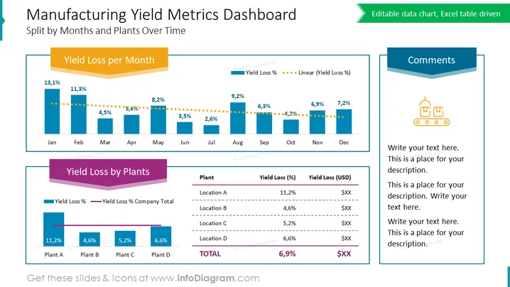
The PowerPoint slide titled "Manufacturing Yield Metrics Dashboard" presents a comparative analysis of yield loss data by month and plant location for an organization. The slide features two charts: the first displays "Yield Loss per Month," with percentages detailed for each month and a dotted line indicating a linear trend. Higher percentages suggest worse performance, while a decreasing trend line suggests improvement over time. The second chart, "Yield Loss by Plants," compares the yield loss percentages and corresponding financial loss in USD across various plant locations, emphasizing the varying performance at each production site. A summary table including the names of plant locations (Location A-D) and their respective yield loss percentages and financial impact accompanies the graphs.
The PowerPoint slide "Manufacturing Yield Metrics Dashboard" presents a visual representation of yield losses in manufacturing over time, segmented by months and plants. "Yield Loss per Month" shows a bar graph with each bar representing a month and its corresponding yield loss percentage, with an overlaying dotted trend line indicating the general direction of these percentages over the year. "Yield Loss by Plants" is another graph showing the percentage and cost value of yield losses at different plant locations, helping to pinpoint areas of concern. This slide would be useful to analyze and discuss manufacturing efficiency and financial implications due to yield loss.
The slide visually combines both graphical data representation and text elements ## Use Cases


