

Your graphics add a nice touch to my presentations and I recently used them for one of my all-hands meetings. Your toolbox adds professionalism to my slides. Instead of using standard clipart.
Claude Jones, Director of Engineer, @Walmartlabs, USA

Your graphics add a nice touch to my presentations and I recently used them for one of my all-hands meetings. Your toolbox adds professionalism to my slides. Instead of using standard clipart.
Claude Jones, Director of Engineer, @Walmartlabs, USA
I needed a fresh look at some of my slides. I've tried to find a way to create a paintbrush effect, to underline, accentuate, add some color and the handwritten markers were just the things. Very easy to use, easy to size, change the color. It was an affordable, perfect solution and I'm happy to recommend it.
Anonymous, US
The crisp, clean look of the graphics, and the fact that it allowed me to easily edit and change the colors to match the template was my main reason for purchasing them.
Brandie Jenkins, E-learning Developer, USA
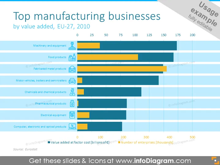
This slide presents a comparison of the top manufacturing sectors in the EU-27 region in the year 2010, based on their value added. Each sector is represented by a horizontal bar segmented into two parts: one illustrating the 'Value added at factor cost (billions of euro)' and the other showing the 'Number of enterprises (thousands)'. Sectors include Machinery and Equipment, Food Products, Fabricated Metal Products, Motor Vehicles, Trailers and Semi-trailers, Chemicals and Chemical Products, Pharmaceutical Products, Electrical Equipment, and Computer, Electronic, and Optical Products.
The slide is visually well organized, with a clear distinction between the value added and the number of enterprises for each manufacturing sector. The contrasting blue bars make it easy to differentiate between the two metrics being compared.



