

Your graphics add a nice touch to my presentations and I recently used them for one of my all-hands meetings. Your toolbox adds professionalism to my slides. Instead of using standard clipart.
Claude Jones, Director of Engineer, @Walmartlabs, USA

Your graphics add a nice touch to my presentations and I recently used them for one of my all-hands meetings. Your toolbox adds professionalism to my slides. Instead of using standard clipart.
Claude Jones, Director of Engineer, @Walmartlabs, USA
I needed a fresh look at some of my slides. I've tried to find a way to create a paintbrush effect, to underline, accentuate, add some color and the handwritten markers were just the things. Very easy to use, easy to size, change the color. It was an affordable, perfect solution and I'm happy to recommend it.
Anonymous, US
The crisp, clean look of the graphics, and the fact that it allowed me to easily edit and change the colors to match the template was my main reason for purchasing them.
Brandie Jenkins, E-learning Developer, USA
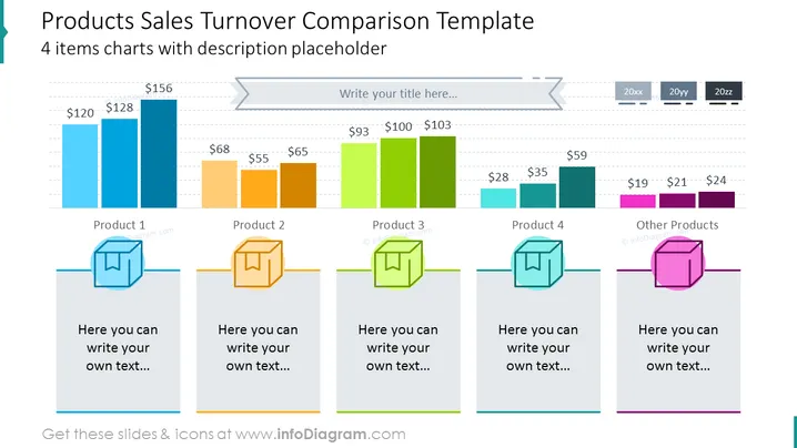
The slide presents sales data for four different products and a category for other products, using bar charts to visualize the comparison of sales turnover across different years. Product 1 shows a consistent turnover of $120 and $128 million over two periods. Product 2 exhibits a dip from $68 million to $65 million. Product 3 has an increasing trend from $93 million to over $100 million. Product 4 has sales that rise from $28 million to $35 million. Other Products have relatively lower figures that range from $19 million to $24 million. Below each product's graph, there is a space for additional descriptions or commentary.
The slide is clean and visually balanced, with a strong use of color to distinguish between products. The icons and bar charts add an element of visual engagement to the otherwise data-driven presentation.



