

Your graphics add a nice touch to my presentations and I recently used them for one of my all-hands meetings. Your toolbox adds professionalism to my slides. Instead of using standard clipart.
Claude Jones, Director of Engineer, @Walmartlabs, USA

Your graphics add a nice touch to my presentations and I recently used them for one of my all-hands meetings. Your toolbox adds professionalism to my slides. Instead of using standard clipart.
Claude Jones, Director of Engineer, @Walmartlabs, USA
I needed a fresh look at some of my slides. I've tried to find a way to create a paintbrush effect, to underline, accentuate, add some color and the handwritten markers were just the things. Very easy to use, easy to size, change the color. It was an affordable, perfect solution and I'm happy to recommend it.
Anonymous, US
The crisp, clean look of the graphics, and the fact that it allowed me to easily edit and change the colors to match the template was my main reason for purchasing them.
Brandie Jenkins, E-learning Developer, USA
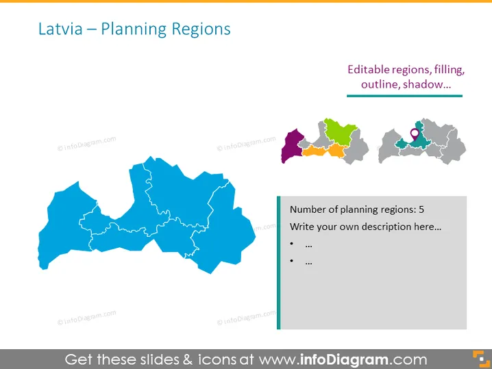
This PowerPoint slide is titled "Latvia – Planning Regions" and appears to be focused on illustrating the administrative divisions of Latvia. There is a large map on the left in a bright blue color, depicting the outline of Latvia with its internal regional borders. On the top right, there are small colorful versions of the Latvia regions, which indicate that these segments are editable, as they include text such as "Editable regions, filling, outline, shadow…" Next to this, there is a gray map section with a marker icon on it. To the right, there's a textbox with the header "Number of planning regions: 5" and space provided to "Write your own description here…" followed by bullet points.
The slide is visually balanced with a large, central focal point and smaller, detailed sections providing specific information. The use of color is strategic, drawing attention to editable areas and informational content.



