

Your graphics add a nice touch to my presentations and I recently used them for one of my all-hands meetings. Your toolbox adds professionalism to my slides. Instead of using standard clipart.
Claude Jones, Director of Engineer, @Walmartlabs, USA

Your graphics add a nice touch to my presentations and I recently used them for one of my all-hands meetings. Your toolbox adds professionalism to my slides. Instead of using standard clipart.
Claude Jones, Director of Engineer, @Walmartlabs, USA
I needed a fresh look at some of my slides. I've tried to find a way to create a paintbrush effect, to underline, accentuate, add some color and the handwritten markers were just the things. Very easy to use, easy to size, change the color. It was an affordable, perfect solution and I'm happy to recommend it.
Anonymous, US
The crisp, clean look of the graphics, and the fact that it allowed me to easily edit and change the colors to match the template was my main reason for purchasing them.
Brandie Jenkins, E-learning Developer, USA
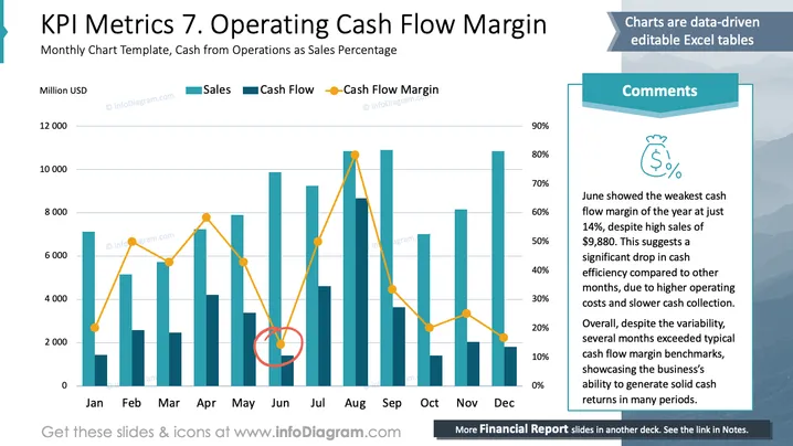
The chart illustrates the relationship between sales, cash flow, and cash flow margin across different months of the year. Sales, represented in teal bars, show varying monthly performance. Cash flow, marked with another shade of teal, follows a similar pattern. The cash flow margin, depicted by a yellow line with dots, highlights the percentage of cash flow relative to sales. Notably, June has the lowest cash flow margin, despite high sales, indicating reduced cash efficiency.
The slide is a visually clear representation of monthly KPI metrics using distinct color coding and labels for easy comparison. The design allows for quick identification of trends and anomalies in financial metrics.



