

Your graphics add a nice touch to my presentations and I recently used them for one of my all-hands meetings. Your toolbox adds professionalism to my slides. Instead of using standard clipart.
Claude Jones, Director of Engineer, @Walmartlabs, USA

Your graphics add a nice touch to my presentations and I recently used them for one of my all-hands meetings. Your toolbox adds professionalism to my slides. Instead of using standard clipart.
Claude Jones, Director of Engineer, @Walmartlabs, USA
I needed a fresh look at some of my slides. I've tried to find a way to create a paintbrush effect, to underline, accentuate, add some color and the handwritten markers were just the things. Very easy to use, easy to size, change the color. It was an affordable, perfect solution and I'm happy to recommend it.
Anonymous, US
The crisp, clean look of the graphics, and the fact that it allowed me to easily edit and change the colors to match the template was my main reason for purchasing them.
Brandie Jenkins, E-learning Developer, USA
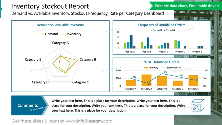
The slide titled 'Inventory Stockout Report' compares demand versus available inventory and analyzes stockout frequency, including a rate-per-category dashboard. It features a radar chart for Demand vs. Inventory, exhibiting discrepancies amongst categories A through E. A bar graph details the Frequency of Unfilled Orders per product (A to E) across four quarters. Lastly, a stacked bar chart shows the percentage of Unfilled Orders, contrasting inventory and stockout rates for each category. These visualizations provide insight into inventory management performance and highlight potential shortages or overstock conditions.
The slide has a balanced and descriptive design, utilizing chart colors that clearly distinguish between different data sets. The graphical elements are structured to guide the observer logically from an overall category comparison to specific product details.
The "Inventory Stockout Report" slide provides a detailed breakdown of inventory management metrics. Specifically, it contrasts "Demand vs. Available Inventory" across five product categories, represented by a radar chart that provides a quick view of discrepancy between demand and actual inventory levels for each category. Additionally, the slide shows a bar graph titled "Frequency of Unfilled Orders," categorizing order fulfillment issues by quarter for each product, and a "Percentage of Unfilled Orders" graph that juxtaposes inventory amounts with stockout rates, helping viewers to identify products with higher stockout percentages relative to their inventory levels. Each graphical representation gives stakeholders an insights into supply chain efficiency and areas that may require attention.
The slide is aesthetically well-organized and informative. The color palette is professional and the charts are cleanly designed for straightforward data interpretation.



