

Your graphics add a nice touch to my presentations and I recently used them for one of my all-hands meetings. Your toolbox adds professionalism to my slides. Instead of using standard clipart.
Claude Jones, Director of Engineer, @Walmartlabs, USA

Your graphics add a nice touch to my presentations and I recently used them for one of my all-hands meetings. Your toolbox adds professionalism to my slides. Instead of using standard clipart.
Claude Jones, Director of Engineer, @Walmartlabs, USA
I needed a fresh look at some of my slides. I've tried to find a way to create a paintbrush effect, to underline, accentuate, add some color and the handwritten markers were just the things. Very easy to use, easy to size, change the color. It was an affordable, perfect solution and I'm happy to recommend it.
Anonymous, US
The crisp, clean look of the graphics, and the fact that it allowed me to easily edit and change the colors to match the template was my main reason for purchasing them.
Brandie Jenkins, E-learning Developer, USA
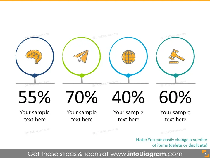
The PowerPoint slide depicts a visual representation of four statistical metrics, each encircled and colored differently, symbolizing distinct categories or subjects. The first is marked by 55% with a brain icon suggesting cognitive-related results. The next shows 70% accompanied by a paper plane icon, possibly denoting communication or marketing achievements. The third circle contains a globe icon with a 40% mark, hinting at global reach or international presence. Lastly, a 60% rating alongside courtroom gavel icons, indicating legal or governance-related outcomes. Each percentage is followed by a placeholder for additional text.
The slide is clean and minimalistic, with a balanced use of space that aids in emphasizing the data presented by each statistic. The color-coding and icons serve both an aesthetic and functional purpose, assisting in the quick perception of the categories each statistic pertains to.



