

Your graphics add a nice touch to my presentations and I recently used them for one of my all-hands meetings. Your toolbox adds professionalism to my slides. Instead of using standard clipart.
Claude Jones, Director of Engineer, @Walmartlabs, USA

Your graphics add a nice touch to my presentations and I recently used them for one of my all-hands meetings. Your toolbox adds professionalism to my slides. Instead of using standard clipart.
Claude Jones, Director of Engineer, @Walmartlabs, USA
I needed a fresh look at some of my slides. I've tried to find a way to create a paintbrush effect, to underline, accentuate, add some color and the handwritten markers were just the things. Very easy to use, easy to size, change the color. It was an affordable, perfect solution and I'm happy to recommend it.
Anonymous, US
The crisp, clean look of the graphics, and the fact that it allowed me to easily edit and change the colors to match the template was my main reason for purchasing them.
Brandie Jenkins, E-learning Developer, USA
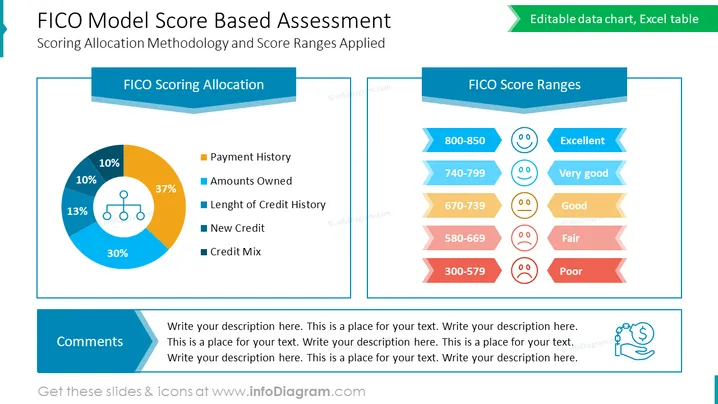
The PowerPoint slide "FICO Model Score Based Assessment" depicts the Scoring Allocation Methodology and Score Ranges Applied for FICO scores. It divides the scoring criteria into a pie chart: 37% Payment History (significance of an individual's track record in paying debts), 30% Amounts Owned (the total sum of money a person owes), 13% Length of Credit History (how long a person has been using credit), 10% New Credit (the number of recently opened credit accounts), and 10% Credit Mix (variety of credit types a person has). Adjacently, FICO Score Ranges are graphically represented in a bar format accompanied by smiley face icons to illustrate performance levels: 800-850 Excellent, 740-799 Very good, 670-739 Good, 580-669 Fair, 300-579 Poor.
The overall look of the slide is clean ## Use Cases



