
Your graphics add a nice touch to my presentations and I recently used them for one of my all-hands meetings. Your toolbox adds professionalism to my slides. Instead of using standard clipart.
Claude Jones, Director of Engineer, @Walmartlabs, USA

Your graphics add a nice touch to my presentations and I recently used them for one of my all-hands meetings. Your toolbox adds professionalism to my slides. Instead of using standard clipart.
Claude Jones, Director of Engineer, @Walmartlabs, USA

I needed a fresh look at some of my slides. I've tried to find a way to create a paintbrush effect, to underline, accentuate, add some color and the handwritten markers were just the things. Very easy to use, easy to size, change the color. It was an affordable, perfect solution and I'm happy to recommend it.
Anonymous, US
The crisp, clean look of the graphics, and the fact that it allowed me to easily edit and change the colors to match the template was my main reason for purchasing them.
Brandie Jenkins, E-learning Developer, USA
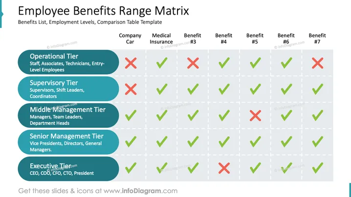
The slide is titled "Employee Benefits Range Matrix" and displays a comparison table template that outlines various employee benefits across different employment levels. These levels include Operational Tier (Staff, Associates, Technicians, Entry-Level Employees), Supervisory Tier (Supervisors, Shift Leaders, Coordinators), Middle Management Tier (Managers, Team Leaders, Department Heads), Senior Management Tier (Vice Presidents, Directors, General Managers), and Executive Tier (CEO, COO, CFO, CTO, President). The benefits listed are Company Car, Medical Insurance, and five other unnamed benefits, indicated as Benefit #3 to Benefit #7. The presence or absence of each benefit for the respective employment tier is visually marked with a green checkmark or a red cross.
The slide has a clean and professional design, utilizing contrasting colors to effectively distinguish between the various elements. The use of iconography simplifies the comprehension of the data presented.


