

Your graphics add a nice touch to my presentations and I recently used them for one of my all-hands meetings. Your toolbox adds professionalism to my slides. Instead of using standard clipart.
Claude Jones, Director of Engineer, @Walmartlabs, USA

Your graphics add a nice touch to my presentations and I recently used them for one of my all-hands meetings. Your toolbox adds professionalism to my slides. Instead of using standard clipart.
Claude Jones, Director of Engineer, @Walmartlabs, USA
I needed a fresh look at some of my slides. I've tried to find a way to create a paintbrush effect, to underline, accentuate, add some color and the handwritten markers were just the things. Very easy to use, easy to size, change the color. It was an affordable, perfect solution and I'm happy to recommend it.
Anonymous, US
The crisp, clean look of the graphics, and the fact that it allowed me to easily edit and change the colors to match the template was my main reason for purchasing them.
Brandie Jenkins, E-learning Developer, USA
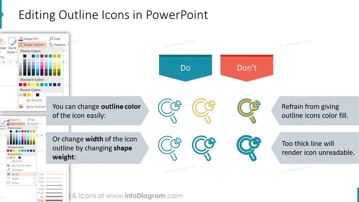
The slide is about best practices for editing outline icons in PowerPoint. It provides guidance on what to "Do" and what "Don't" to preserve the clarity and effectiveness of icons. Specifically, it suggests that users can change the outline color of icons easily to match their slide's design theme. "Do" refers to the best practice of changing color or thickness of the icon outline to suit presentation needs, allowing for customizability and visual appeal. In contrast, "Don't" involves two warnings: Not to give outline icons a color fill, as it can compromise their visibility, and to avoid using too thick lines when adjusting icon weight, which can make the icon unreadable.
The slide presents a clean and modern aesthetic with clear visual separation between recommended actions and common mistakes. The use of contrasting colors and straightforward iconography aids in quickly conveying the message.



