

Your graphics add a nice touch to my presentations and I recently used them for one of my all-hands meetings. Your toolbox adds professionalism to my slides. Instead of using standard clipart.
Claude Jones, Director of Engineer, @Walmartlabs, USA

Your graphics add a nice touch to my presentations and I recently used them for one of my all-hands meetings. Your toolbox adds professionalism to my slides. Instead of using standard clipart.
Claude Jones, Director of Engineer, @Walmartlabs, USA
I needed a fresh look at some of my slides. I've tried to find a way to create a paintbrush effect, to underline, accentuate, add some color and the handwritten markers were just the things. Very easy to use, easy to size, change the color. It was an affordable, perfect solution and I'm happy to recommend it.
Anonymous, US
The crisp, clean look of the graphics, and the fact that it allowed me to easily edit and change the colors to match the template was my main reason for purchasing them.
Brandie Jenkins, E-learning Developer, USA
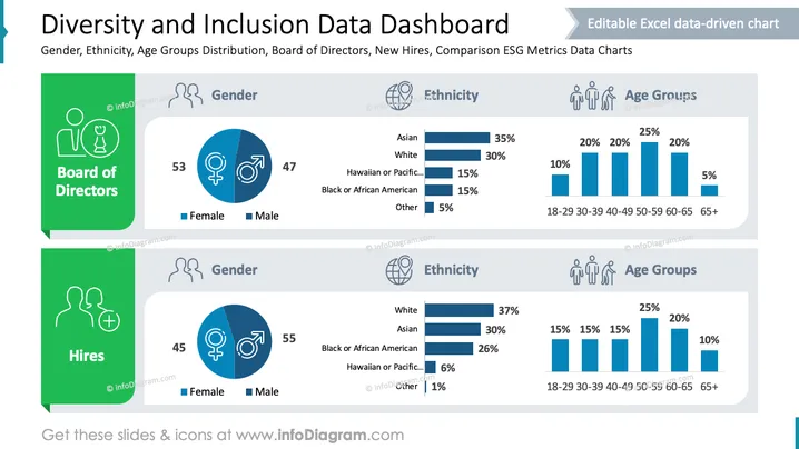
The slide presents a "Diversity and Inclusion Data Dashboard" focusing on gender, ethnicity, and age group distribution. It compares data between "Board of Directors" and "Hires." For the Board, gender distribution shows 53% female and 47% male. Ethnicities include 35% Asian, 30% White, 15% Hawaiian or Pacific Islander, 15% Black or African American, and 5% Other. Age groups range from 18-29 at 10% to 65+ at 5%. For Hires, gender is 45% female and 55% male; ethnicities are 37% White, 30% Asian, 26% Black or African American, 6% Hawaiian or Pacific Islander, and 1% Other. Age groups vary from 18-29 at 15% to 65+ at 10%.
The slide effectively uses visuals to emphasize diversity statistics. Icons and color differentiation provide an accessible, clear presentation of the data.



