
Your graphics add a nice touch to my presentations and I recently used them for one of my all-hands meetings. Your toolbox adds professionalism to my slides. Instead of using standard clipart.
Claude Jones, Director of Engineer, @Walmartlabs, USA
Your graphics add a nice touch to my presentations and I recently used them for one of my all-hands meetings. Your toolbox adds professionalism to my slides. Instead of using standard clipart.
Claude Jones, Director of Engineer, @Walmartlabs, USA
I needed a fresh look at some of my slides. I've tried to find a way to create a paintbrush effect, to underline, accentuate, add some color and the handwritten markers were just the things. Very easy to use, easy to size, change the color. It was an affordable, perfect solution and I'm happy to recommend it.
Anonymous, US
The crisp, clean look of the graphics, and the fact that it allowed me to easily edit and change the colors to match the template was my main reason for purchasing them.
Brandie Jenkins, E-learning Developer, USA
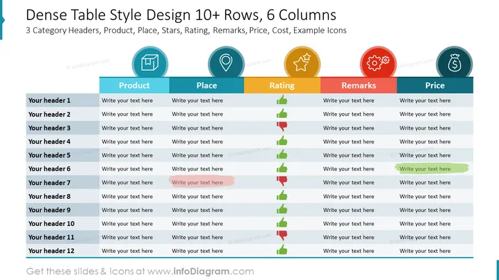
The PowerPoint slide is titled "Dense Table Style Design 10+ Rows, 6 Columns" and appears to be a template for displaying data across six categories: Product, Place, Rating, Remarks, Price, and Cost, with placeholder icons for each category. Each row, numbered with "Your header 1" through "Your header 12," has space to write text, allowing for a detailed comparison or listing of items. The Rating category includes green, amber, and red bars, possibly to visually represent positive, neutral, and negative ratings respectively.
The slide uses flat design icons and simple color coding to visually separate information, creating a structured and easily navigable presentation element.




