
Your graphics add a nice touch to my presentations and I recently used them for one of my all-hands meetings. Your toolbox adds professionalism to my slides. Instead of using standard clipart.
Claude Jones, Director of Engineer, @Walmartlabs, USA

Your graphics add a nice touch to my presentations and I recently used them for one of my all-hands meetings. Your toolbox adds professionalism to my slides. Instead of using standard clipart.
Claude Jones, Director of Engineer, @Walmartlabs, USA

I needed a fresh look at some of my slides. I've tried to find a way to create a paintbrush effect, to underline, accentuate, add some color and the handwritten markers were just the things. Very easy to use, easy to size, change the color. It was an affordable, perfect solution and I'm happy to recommend it.
Anonymous, US
The crisp, clean look of the graphics, and the fact that it allowed me to easily edit and change the colors to match the template was my main reason for purchasing them.
Brandie Jenkins, E-learning Developer, USA
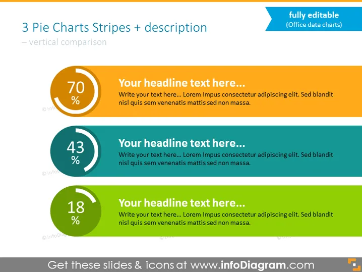
The PowerPoint slide presents a comparison of three statistical values using pie charts and accompanying text. Each chart has a large percentage in the center, suggesting they are measuring parts of a whole. The first chart is orange with 70%, the second is teal with 43%, and the third is green with 18%. The pie charts are paired with placeholder headlines and text, indicative of a template that can be customized with specific data and descriptions. The three sections offer a clear visual hierarchy for comparing the percentage values and provide space for descriptive content.
The slide's overall look is clean and modern with a color scheme that effectively differentiates between the three data points. The use of contrasting colors complements the visual hierarchy intended for the comparison of data.


