

Your graphics add a nice touch to my presentations and I recently used them for one of my all-hands meetings. Your toolbox adds professionalism to my slides. Instead of using standard clipart.
Claude Jones, Director of Engineer, @Walmartlabs, USA

Your graphics add a nice touch to my presentations and I recently used them for one of my all-hands meetings. Your toolbox adds professionalism to my slides. Instead of using standard clipart.
Claude Jones, Director of Engineer, @Walmartlabs, USA
I needed a fresh look at some of my slides. I've tried to find a way to create a paintbrush effect, to underline, accentuate, add some color and the handwritten markers were just the things. Very easy to use, easy to size, change the color. It was an affordable, perfect solution and I'm happy to recommend it.
Anonymous, US
The crisp, clean look of the graphics, and the fact that it allowed me to easily edit and change the colors to match the template was my main reason for purchasing them.
Brandie Jenkins, E-learning Developer, USA
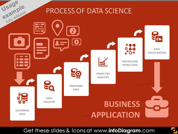
The slide depicts the various stages in data science leading to business application. Starting with "Gathering Data," which involves the collection of raw data from various sources. "Preparing Data" signifies the process of cleaning and organizing data for analysis. Then, "Data Analysis" refers to the examination and processing of data to extract useful information. "Predictive Analysis" is about using data to forecast future trends and outcomes. "Knowledge Extraction" involves deriving insights and patterns from the analyzed data. The final step, "Data Visualization," is about representing data in visual formats like charts or graphs. All these steps flow toward "Business Application," suggesting the practical implementation of data insights.
The overall look is modern and clean, emphasizing process flow with a strong visual hierarchy that leads the viewer's eye from left to right, culminating in the practical application of data science in business.



