

Your graphics add a nice touch to my presentations and I recently used them for one of my all-hands meetings. Your toolbox adds professionalism to my slides. Instead of using standard clipart.
Claude Jones, Director of Engineer, @Walmartlabs, USA

Your graphics add a nice touch to my presentations and I recently used them for one of my all-hands meetings. Your toolbox adds professionalism to my slides. Instead of using standard clipart.
Claude Jones, Director of Engineer, @Walmartlabs, USA
I needed a fresh look at some of my slides. I've tried to find a way to create a paintbrush effect, to underline, accentuate, add some color and the handwritten markers were just the things. Very easy to use, easy to size, change the color. It was an affordable, perfect solution and I'm happy to recommend it.
Anonymous, US
The crisp, clean look of the graphics, and the fact that it allowed me to easily edit and change the colors to match the template was my main reason for purchasing them.
Brandie Jenkins, E-learning Developer, USA
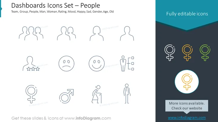
The slide appears to be showcasing a set of icons related to people for use in dashboard applications. The headings include terms like "Team," "Group," "People," "Man," "Woman," "Rating," "Mood," "Happy," "Sad," "Gender," "Age," and "Old." These represent different categories or filters that could be used within a dashboard to sort or represent data. Each term indicates a specific aspect of human demographics or characteristics, suggesting a comprehensive approach to categorizing individuals for analytical or presentation purposes.
The slide's design is straightforward and uses icons effectively to communicate different social and demographic categories. This simplicity enables easy understanding and quick visual processing for viewers.



