

Your graphics add a nice touch to my presentations and I recently used them for one of my all-hands meetings. Your toolbox adds professionalism to my slides. Instead of using standard clipart.
Claude Jones, Director of Engineer, @Walmartlabs, USA

Your graphics add a nice touch to my presentations and I recently used them for one of my all-hands meetings. Your toolbox adds professionalism to my slides. Instead of using standard clipart.
Claude Jones, Director of Engineer, @Walmartlabs, USA
I needed a fresh look at some of my slides. I've tried to find a way to create a paintbrush effect, to underline, accentuate, add some color and the handwritten markers were just the things. Very easy to use, easy to size, change the color. It was an affordable, perfect solution and I'm happy to recommend it.
Anonymous, US
The crisp, clean look of the graphics, and the fact that it allowed me to easily edit and change the colors to match the template was my main reason for purchasing them.
Brandie Jenkins, E-learning Developer, USA
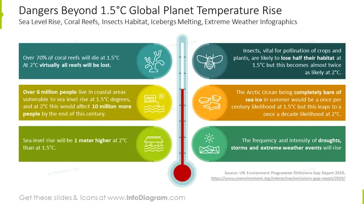
The PowerPoint slide illustrates the severe environmental impacts of global warming beyond 1.5°C. It discusses the threat to coral reefs, with over 70% dying at 1.5°C and virtual total loss at 2°C; the displacement risk to over 6 million people due to rising sea levels, escalating to 10 million at 2°C; the peril to insect habitats crucial for pollination, halved at 1.5°C, worsening at 2°C; the increased probability of the Arctic Ocean lacking summer sea ice; and the heightened occurrence of extreme weather events.
The slide uses a clear color-coded system to differentiate between the consequences at 1.5°C and 2°C, with cool-toned colors representing the former and warmer tones for the latter. Icons and concise bullet points convey information visually, reinforcing the textual data.
The overall look of the slide is professional and visually appealing. The graphical elements are arranged symmetrically around the thermometer, creating a balanced and focused visual message.



