

Your graphics add a nice touch to my presentations and I recently used them for one of my all-hands meetings. Your toolbox adds professionalism to my slides. Instead of using standard clipart.
Claude Jones, Director of Engineer, @Walmartlabs, USA

Your graphics add a nice touch to my presentations and I recently used them for one of my all-hands meetings. Your toolbox adds professionalism to my slides. Instead of using standard clipart.
Claude Jones, Director of Engineer, @Walmartlabs, USA
I needed a fresh look at some of my slides. I've tried to find a way to create a paintbrush effect, to underline, accentuate, add some color and the handwritten markers were just the things. Very easy to use, easy to size, change the color. It was an affordable, perfect solution and I'm happy to recommend it.
Anonymous, US
The crisp, clean look of the graphics, and the fact that it allowed me to easily edit and change the colors to match the template was my main reason for purchasing them.
Brandie Jenkins, E-learning Developer, USA
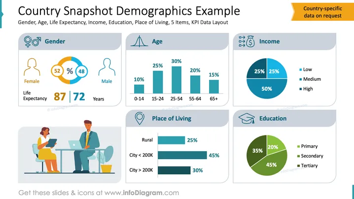
The slide illustrates demographic data visualization, including gender distribution—52% female and 48% male—with life expectancies of 87 and 72 years, respectively. Age statistics are detailed with bar charts: 10% aged 0-14, 25% aged 15-24, and 30% aged 25-54. Income categories split into 25% low, 25% medium, and 50% high income, visualized in a pie chart. Place of living includes 25% rural, 45% in cities under 200K, and 30% in larger cities. Education levels show 35% primary, 45% secondary, and 20% tertiary, also depicted in a pie chart.
The overall design is clear and professional, effectively using graphical elements to convey detailed demographic data. Its consistent color scheme and icon usage add to its visual appeal and clarity.



