

Your graphics add a nice touch to my presentations and I recently used them for one of my all-hands meetings. Your toolbox adds professionalism to my slides. Instead of using standard clipart.
Claude Jones, Director of Engineer, @Walmartlabs, USA

Your graphics add a nice touch to my presentations and I recently used them for one of my all-hands meetings. Your toolbox adds professionalism to my slides. Instead of using standard clipart.
Claude Jones, Director of Engineer, @Walmartlabs, USA
I needed a fresh look at some of my slides. I've tried to find a way to create a paintbrush effect, to underline, accentuate, add some color and the handwritten markers were just the things. Very easy to use, easy to size, change the color. It was an affordable, perfect solution and I'm happy to recommend it.
Anonymous, US
The crisp, clean look of the graphics, and the fact that it allowed me to easily edit and change the colors to match the template was my main reason for purchasing them.
Brandie Jenkins, E-learning Developer, USA
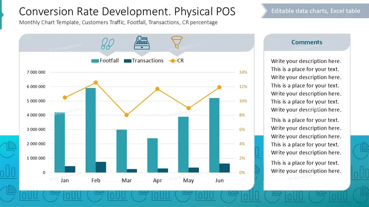
The slide presents a chart tracking conversion rates in a physical point of sale context. It includes:
The data is plotted over six months, showing trends in each category, indicating how foot traffic correlates with sales and conversion percentages.
Chart Area: Contains a bar graph representing footfall and a line graph for conversion rates, with categories divided by months from January to June.
Icons: Three icons represent footfall, transactions, and conversion rate, each illustrating respective concepts visually.
Color Coding: Bars are teal for footfall, a darker shade for transactions, and lines are orange for conversion rate.
Layout: A comments section occupies the right side, allowing space for detailed annotations.
Background: Light, professional background with a hint of thematic design elements enhancing readability.
The slide balances quantitative data visualization with textual explanations, making complex information accessible and visually appealing.



