

Your graphics add a nice touch to my presentations and I recently used them for one of my all-hands meetings. Your toolbox adds professionalism to my slides. Instead of using standard clipart.
Claude Jones, Director of Engineer, @Walmartlabs, USA

Your graphics add a nice touch to my presentations and I recently used them for one of my all-hands meetings. Your toolbox adds professionalism to my slides. Instead of using standard clipart.
Claude Jones, Director of Engineer, @Walmartlabs, USA
I needed a fresh look at some of my slides. I've tried to find a way to create a paintbrush effect, to underline, accentuate, add some color and the handwritten markers were just the things. Very easy to use, easy to size, change the color. It was an affordable, perfect solution and I'm happy to recommend it.
Anonymous, US
The crisp, clean look of the graphics, and the fact that it allowed me to easily edit and change the colors to match the template was my main reason for purchasing them.
Brandie Jenkins, E-learning Developer, USA
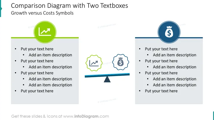
The slide is titled "Comparison Diagram with Two Textboxes" which suggests a tool for juxtaposing two different elements, in this case, "Growth versus Costs Symbols". Each side of the comparison has a colored textbox with placeholder text ("Put your text here" and "Add an item description"), representing points for expansion on the concept it symbolizes. The left side is linked to growth, indicated by an upward arrow in a green circle, suggesting positive trends or financial increase. Conversely, the right side represents costs, with a dollar sign encapsulated in a blue circle, denoting financial expenditures or investments.
The slide employs a clean and modern design with a clear visual distinction between the two compared categories. Its symmetrical layout and contrasting colors aid in delivering a clear comparative message.



