
Your graphics add a nice touch to my presentations and I recently used them for one of my all-hands meetings. Your toolbox adds professionalism to my slides. Instead of using standard clipart.
Claude Jones, Director of Engineer, @Walmartlabs, USA

Your graphics add a nice touch to my presentations and I recently used them for one of my all-hands meetings. Your toolbox adds professionalism to my slides. Instead of using standard clipart.
Claude Jones, Director of Engineer, @Walmartlabs, USA

I needed a fresh look at some of my slides. I've tried to find a way to create a paintbrush effect, to underline, accentuate, add some color and the handwritten markers were just the things. Very easy to use, easy to size, change the color. It was an affordable, perfect solution and I'm happy to recommend it.
Anonymous, US
The crisp, clean look of the graphics, and the fact that it allowed me to easily edit and change the colors to match the template was my main reason for purchasing them.
Brandie Jenkins, E-learning Developer, USA
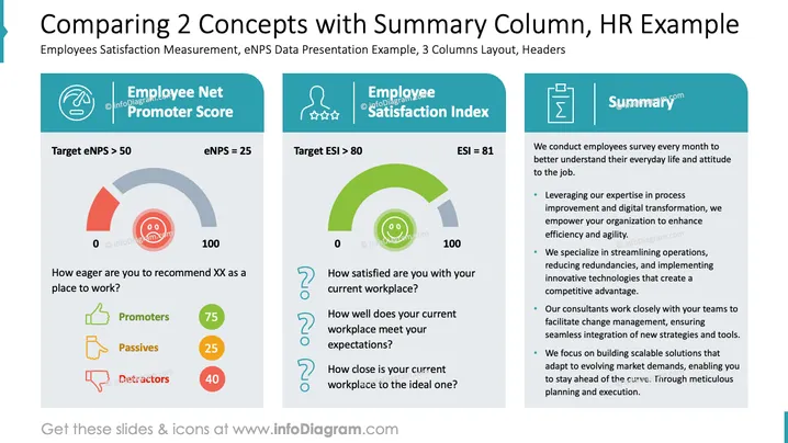
The slide presents a comparison of two key concepts: Employee Net Promoter Score (eNPS) and Employee Satisfaction Index (ESI). The eNPS measures how likely employees are to recommend their workplace, aiming for a target greater than 50; the current score is 25. Satisfaction levels are broken down into promoters, passives, and detractors. The ESI evaluates employee satisfaction with their workplace, aiming for a target over 80, with the current score at 81. A summary on the right outlines strategies for enhancing workplace efficiency and transformation through expertise in process improvement, streamlined operations, and innovative solutions.
Overall, the slide is visually structured with clear sections and a balanced use of icons and colors to illustrate complex concepts effectively. The layout aids in making comparisons and summaries understandable at a glance.


