

Your graphics add a nice touch to my presentations and I recently used them for one of my all-hands meetings. Your toolbox adds professionalism to my slides. Instead of using standard clipart.
Claude Jones, Director of Engineer, @Walmartlabs, USA

Your graphics add a nice touch to my presentations and I recently used them for one of my all-hands meetings. Your toolbox adds professionalism to my slides. Instead of using standard clipart.
Claude Jones, Director of Engineer, @Walmartlabs, USA
I needed a fresh look at some of my slides. I've tried to find a way to create a paintbrush effect, to underline, accentuate, add some color and the handwritten markers were just the things. Very easy to use, easy to size, change the color. It was an affordable, perfect solution and I'm happy to recommend it.
Anonymous, US
The crisp, clean look of the graphics, and the fact that it allowed me to easily edit and change the colors to match the template was my main reason for purchasing them.
Brandie Jenkins, E-learning Developer, USA
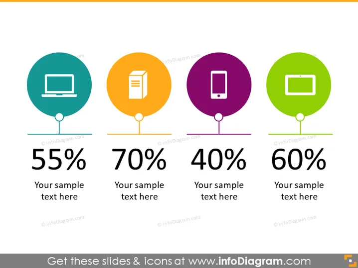
The PowerPoint slide presents a comparative analysis of four different data points. Each data point combines a numerical percentage with a placeholder for sample text to provide context, presumably explaining the significance of the percentage. The four percentages shown are 55%, 70%, 40%, and 60%, each paired with a representative icon that suggests different categories or areas of focus—such as technology platforms, content types, or user engagement levels—and are likely meant to provide a visual aid for quick recognition and understanding of each data point.
The overall look of the slide is clean, modern, and colorful, with the icons and percentages drawing attention. The consistent style and symmetry create an easy-to-digest visual hierarchy that emphasizes the data.



